
Design
Cool Fonts: Unique Typography Styles That Stand Out in Graphic Design
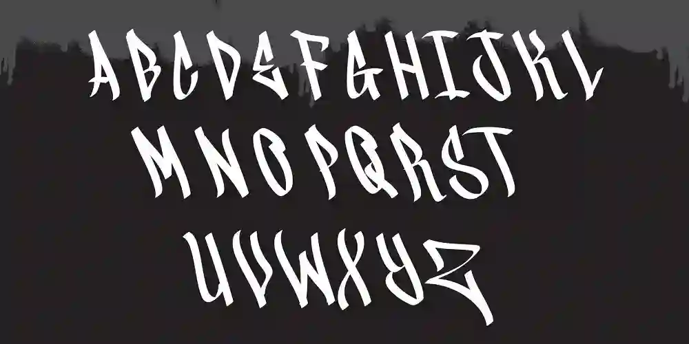
Typography plays a fundamental role in graphic design, influencing the way people perceive brands, messages, and creative works. Among the vast world of typefaces, cool fonts stand out for their uniqueness, personality, and ability to make a lasting impression. Whether for branding, digital media, posters, or social media graphics, choosing the right font can elevate a design from ordinary to extraordinary.
This article explores the characteristics of cool fonts, how they enhance design, and the best unique typefaces that can make your projects stand out.
What Makes a Font Cool?
The term “cool” is subjective, but in typography, cool fonts share some common characteristics that set them apart from traditional or overused typefaces.
- Distinctive and Eye-Catching Design
Cool fonts immediately draw attention due to their unique letterforms, unconventional shapes, or creative embellishments. They often break away from traditional structures while maintaining readability.
- Versatility Across Different Media
A good font should be adaptable for use in logos, posters, digital graphics, websites, and print materials. Versatile cool fonts can maintain their impact across different platforms.
- Balance of Readability and Style
While cool fonts are often creative and bold, they should still be legible. The best cool fonts strike a balance between artistic flair and functional design.
- Memorability
A unique font helps a brand or message stay in the minds of viewers. Distinctive typography can make a design instantly recognizable and create a strong visual identity.
Best Cool Fonts for Graphic Design
Whether you need a bold statement font or a subtle yet creative typeface, these cool fonts can make your designs stand out.
- Bold and Impactful Cool Fonts
These fonts are perfect for posters, headlines, and branding where making a strong impression is key.
- Bebas Neue – A modern sans-serif font with bold, clean lines that work well in posters and banners.
- Anton – A powerful, high-impact typeface great for attention-grabbing headlines.
- Oswald – A strong, condensed sans-serif font that delivers a contemporary and edgy look.
- Rift – A futuristic, sci-fi-inspired font that adds a tech-driven aesthetic.
- Staatliches – A blocky, geometric font with an art deco feel that works well for modern branding.
- Playful and Quirky Cool Fonts
For projects that need a fun, energetic vibe, these fonts bring creativity and personality.
- Pacifico – A smooth, flowing script that adds a casual and friendly feel.
- Lobster – A bold, cursive font with a retro twist, great for branding and packaging.
- Bubblegum Sans – A playful and rounded typeface that exudes a youthful, fun energy.
- Bangers – A comic book-style font that brings action and excitement.
- Fredoka One – A bold, rounded font that’s perfect for playful and cheerful designs.
- Futuristic and Tech-Inspired Cool Fonts
Ideal for digital products, gaming, and technology-related branding.
- Orbitron – A sleek, sci-fi-style font that works well for digital and futuristic themes.
- Exo 2 – A geometric sans-serif with a modern and technical look.
- Audiowide – A stylish, tech-driven typeface that gives off a cyber-inspired feel.
- Neuropol – A sleek and futuristic font with a minimalist edge.
- Rajdhani – A structured, digital-inspired font with sharp lines and angles.
- Elegant and Artistic Cool Fonts
For high-end branding, wedding invitations, and luxury design projects.
- Playfair Display – A sophisticated serif font with a modern, high-contrast look.
- Cinzel – Inspired by classical Roman typography, this font is perfect for luxury branding.
- Tangerine – A calligraphy-style font that adds a refined, elegant touch.
- Bodoni – A timeless, high-contrast serif that exudes class and sophistication.
- Great Vibes – A flowing script font that works beautifully for artistic and elegant designs.
- Minimalist and Modern Cool Fonts
These fonts are sleek and stylish, making them great for branding, UI/UX, and editorial design.
- Montserrat – A geometric sans-serif font with a clean and modern look.
- Raleway – A minimalist font that balances simplicity with elegance.
- Avenir – A timeless sans-serif typeface that is sleek and professional.
- Proxima Nova – A versatile and highly readable modern typeface.
- Futura – A geometric sans-serif font with a futuristic, modern feel.
How to Use Cool Fonts Effectively in Graphic Design
Simply choosing a cool font is not enough; proper implementation ensures the typography enhances the design rather than overpowering it.
- Pair Fonts Strategically
Using a combination of fonts can create visual hierarchy and balance. Pairing a bold headline font with a simple body font improves readability while maintaining style.
- Example: Oswald (headline) + Montserrat (body text)
- Example: Playfair Display (headline) + Lato (body text)
- Use Contrast for Emphasis
Contrast in font size, weight, and color makes typography stand out. A mix of thick and thin strokes can create an eye-catching effect.
- Consider the Medium and Platform
Different fonts work better in specific environments:
- Print materials require highly legible fonts that remain sharp when printed.
- Digital content benefits from web-safe fonts optimized for screens.
- Logos and branding need unique typefaces that remain recognizable at different sizes.
- Avoid Overuse of Decorative Fonts
While decorative fonts add character, using them excessively can make a design look cluttered. Balance decorative fonts with neutral supporting fonts to maintain a clean look.
- Ensure Readability
Even the coolest fonts must be easy to read. Avoid excessive letter spacing, overly intricate designs, or fonts that blend into the background.
Conclusion
Typography is a powerful design element that influences how audiences engage with content. Cool fonts add personality, uniqueness, and impact to graphic design, making them essential tools for designers. Whether for branding, marketing, digital design, or print materials, the right typeface can make all the difference.
By choosing fonts that reflect the project’s personality, pairing them effectively, and maintaining a balance between style and function, designers can create standout visuals that leave a lasting impression. Experiment with different cool fonts to find the perfect match for your next creative project!

Women and men differ in their perceptions of color, brightness, and sizes. This can have an impact on how well UI design works for them.
For example, a pink power tool may be appealing to some women, but it will not appeal to all. Similarly, the reach of their hands could influence how they interact with certain aspects of a UI.
1. Understand the Differences Between the Two Genders
Women and men are often stereotyped as having a variety of characteristics. For example, in the workplace, if a woman doesn’t fit the caring, nurturing feminine stereotype, she may be negatively impacted. In personal relationships, best-selling books and popular magazines claim that it’s hard for men and women to get along because they have different communication styles.
Gender is more than just sex; it’s the array of socially constructed roles and relationships, personality traits, attitudes, behaviors, values and relative power and influence that society ascribes to the two sexes on a differential basis. It’s important to understand these differences because they can be very real, influencing the way we communicate and interact with one another.
For example, men and women differ in their eye sight and hand size; this can impact how they interact with UI, for example, how easy it is to reach small UI components. In the design industry, it’s not uncommon to see products that have been designed for men scaled down and pinked for women.
2. Know Your Audience
Knowing your audience is essential in marketing. It helps you figure out what content and messages they care about, as well as how to speak to them. It also gives you a good idea of what type of tone and voice to use in your marketing.
One of the best ways to get to know your audience is through surveys. This can be done for both new and existing audiences. Surveys can provide you with very specific details on what your audiences enjoy about your products or services, what they recommend you work on, and more.
For example, men like to see testimonials and evidence that others have benefited from a product or service. Women, on the other hand, prefer more detailed stories with a well-composed conclusion. Knowing this can help you create a more effective advertisement for men or women. It can also make your writing much more persuasive. If you can convince your audience that what you have to say is valuable, they are more likely to buy your product or service.
3. Know the Differences Between the Two Genders
Gender is highly personal and central to who people are. It isn’t something that should be ignored by designers or treated as a binary choice.
Gender identity is different from sex, which refers to the biological differences between male, female and intersex. Gender is also related to how a person might dress, present themselves and even their gender presentation isn’t necessarily the way they identify – they may use he/him or she/her or a combination of both.
The problem with stereotypes is that they can be detrimental to people, especially when it comes to a product or service they use. It can be offensive, it can cause problems for a user experience and in some cases can result in significant product debt as AirBnb discovered when they forgot to include gender as part of their design process. They ended up spending a lot of time trying to fix their product. This is something that can be avoided by ensuring gender is taken into account from the beginning of the design process.
4. Understand The Differences Between the Two Genders
Men and women process information differently. Women operate on an emotional and tactile basis, while men are more analytical. In order to design products that appeal to both genders, it is necessary to understand their differing perspectives.
For example, if a product is designed for men and then “shrunk” and “pinkened” for women, it may be counter-productive. It could lead to an inferior product and a negative perception of the brand.
It is also important to note that sex and gender are not the same thing. Sex refers to physical characteristics, such as a person’s internal and external genitalia, while gender is the array of complex psychosocial self-perceptions, attitudes, behaviors, values, and relative power and influence that society assigns to men and women on a differential basis. Gender differences influence many determinants of health and disease. This is true for developing and industrialized countries alike.

KemonoParty: Your One-Stop Destination for Art!

Join Metabet63 Today for an Amazing Sports Betting Experience

Cool Fonts: Unique Typography Styles That Stand Out in Graphic Design

Toto Site Verification: Avoiding Eat-and-Run Risks

Win Big at Kudaponi88: Best Casino Games & Slots

Tobacco Tangiers – Buy Online & Enjoy Rich Hookah Sessions

All Butterfly Knife Cases in CSGO (CS2)

6 Things You Need to Know About Buying YouTube Comments

How can education helps in attaining safe and security?

Literature Gap: What It Means And How To Find It

15 Different Types of Technology We Use Everyday

9 Reasons Why We Need Education

Top 12 Marketing Agencies to Grow Your Business in 2023

6 Natural Health and Nutrition Tips That Are Evidence-Based
-
 Social Media2 years ago
6 Things You Need to Know About Buying YouTube Comments
-
 Safety & Security2 years ago
How can education helps in attaining safe and security?
-
 Education2 years ago
Literature Gap: What It Means And How To Find It
-
 Technology2 years ago
15 Different Types of Technology We Use Everyday
-
 Education2 years ago
9 Reasons Why We Need Education
-
 Marketing2 years ago
Top 12 Marketing Agencies to Grow Your Business in 2023
-
 Health & Fitness2 years ago
6 Natural Health and Nutrition Tips That Are Evidence-Based
-

 Home & Garden2 years ago
What’s the Cheapest Roofing Material for a Roof Replacement?